Mobile-first indexing determines how contractor websites rank by prioritizing the mobile version of content. Sites that lack content parity, speed, and usability on mobile devices lose visibility and high-intent leads.
Key takeaways:
- Mobile-first indexing uses the mobile version for ranking.
- Content parity between desktop and mobile is critical.
- Thumb-friendly design improves engagement and conversions.
- Page speed and INP directly impact mobile rankings.
- Mobile searches often have strong local intent.
- Optimized mobile UX increases map pack visibility.
When contractors prioritize mobile performance, usability, and complete content, search engines reward their sites with better rankings and stronger local lead generation.
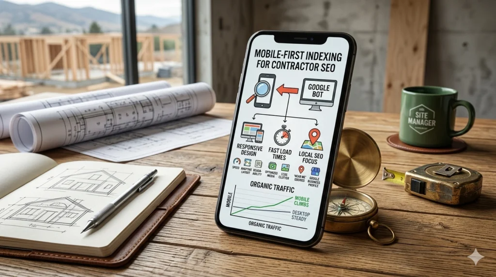
For years, contractors built websites on large desktop monitors and then checked to see if they worked on a phone as an afterthought. In 2026, this approach is a recipe for search-engine invisibility. Google now uses mobile-first indexing exclusively, which means it predominantly crawls and ranks the mobile version of your content. If your mobile site is a stripped-down version of your desktop site, you are likely losing rank on the very pages intended to generate your highest-value leads.
In the trades, the transition to mobile is even more pronounced because of the emergency nature of the work. Over 65% of all web traffic is now mobile, but for home services, that number often spikes to 80% or higher for urgent repairs. Understanding the technical requirements of mobile-first indexing is the difference between appearing in the Local Map Pack and being buried on the second page of results.
The Death of Content Parity Issues
The most common mistake contractors make is hiding content on mobile to simplify the design. If you have a detailed 1,000-word guide on Commercial Roofing Maintenance on your desktop site but hide half of it behind a “Read More” button or remove it entirely for mobile users, search engines may stop indexing that hidden text. In 2026, content parity—ensuring the mobile site has the same high-quality information as the desktop version—is a critical ranking factor.
While you can use accordions or tabs to save space, the content must be present in the initial HTML code. A search-engine bot needs to see the same headers, technical specifications, and internal links on mobile that it sees on desktop. If your mobile site is thin, your authority will be viewed as thin, regardless of how much effort you put into the desktop experience.
Thumb-Friendly UX and Lead Conversion
Mobile-first indexing also evaluates usability signals. For a contractor, the primary goal of a mobile site is to get the user to call or book an appointment. If your Request a Quote button is too small to tap with a thumb, or if your phone number isn’t click-to-call enabled, users will bounce back to the search results. High bounce rates on mobile tell the algorithm that your page is not a quality result for mobile users.
Optimizing for the thumb zone, which is the area of the screen most easily reached during one-handed use, is now a standard SEO practice. Placing your primary Call to Action (CTA) in the bottom third of the screen and ensuring that all tap targets are at least 48 pixels in size prevents user frustration. A site that is easy to navigate with one hand while a homeowner is standing in a dark basement looking at a furnace is a site that converts.
Speed and the Core Web Vitals Standard
In 2026, the Interaction to Next Paint (INP) metric is the gold standard for mobile performance. It measures the latency of every user interaction, such as clicking a gallery image or opening a contact form. For contractor sites filled with high-resolution before-and-after photos, mobile speed is often the biggest hurdle. A mobile site that takes longer than 2.5 seconds to load will see an immediate drop in both user retention and search visibility.
Using next-generation image formats like AVIF and implementing lazy-loading ensures that your site stays fast. Lazy loading instructs the browser to only load images as the user scrolls down to them, which preserves bandwidth and processing power for the initial page view. For a mobile user on a 5G or 4G connection, this speed is the difference between a booked job and a lost lead.
Mobile-Optimized Local Search Intent
Mobile searches are significantly more likely to have local intent. When someone searches for “plumber near me” on a mobile device, Google uses the precise GPS location of the phone to provide results. If your mobile site is technically sound, you have a much higher chance of appearing in the Near Me results that dominate mobile search pages.
This local connection is reinforced by the metadata of your mobile site. Ensuring your Name, Address, and Phone Number (NAP) are in a mobile-friendly footer and that your Schema markup is correctly implemented for mobile crawlers helps the algorithm pin your business to a specific geographic area. Mobile-first indexing rewards the contractors who make it easy for both bots and humans to verify their physical location.
Conclusion
Mobile-first indexing is not a technical hurdle to overcome; it is a reflection of how your customers actually find you. In the construction and service trades, the mobile moment is usually the moment of highest intent, such as when a customer needs help immediately. By prioritizing content parity, thumb-friendly navigation, and extreme loading speeds, you align your business with the standards of 2026. A website built for the smartphone is a website built for the modern homeowner, which ensures that when the emergency call comes, your business is the one that answers.

