Contact forms that convert help home service businesses capture more leads by reducing friction at the final step of the customer journey. Simple fields, mobile-friendly design, trust signals, and clear next steps make it easier for homeowners to submit inquiries instead of abandoning the page.
Key takeaways:
- Overly long forms create friction and lower conversions
- Multi-step forms make inquiries feel easier to complete
- Real-time validation prevents frustration before submission
- Trust signals near the form increase user confidence
- Mobile-first form design is critical for service leads
- The thank-you page should confirm clear next steps
When home service businesses simplify forms, improve mobile usability, and clarify what happens after submission, more website visitors become qualified leads and booked service calls.
The contact form is the final hurdle in your digital-sales process. You have done the hard work of ranking in search results, building trust through your content, and convincing the homeowner that you are the right expert for the job. However, if your contact form is intimidating, broken, or overly complicated, all that effort is wasted. In 2026, the psychology of the “Online Inquiry” has changed. Users want a balance between ease of use and the assurance that their request is being handled by a professional.
A high-converting form is not just a collection of input boxes; it is a communication tool. For home-service businesses, the goal of a form is twofold: to capture the lead as quickly as possible and to provide enough information for your team to qualify the opportunity. Achieving this balance requires a deep understanding of user-experience design and a ruthless commitment to removing friction points that cause potential clients to abandon the process.
The Problem with Traditional Form Design
Many contractors still use “Old-School” forms that ask for too much information upfront. Asking for a home address, a project budget, and a detailed description in a single, massive block of text is a major conversion killer. In 2026, the “Cognitive Load” of a form determines its success. If a homeowner feels overwhelmed by the number of fields they need to fill out, they will simply leave and find a competitor with a simpler interface.
This is especially true for mobile users. Typing on a smartphone is inherently more difficult than on a desktop. Every additional field you add to your form decreases your conversion rate by a measurable percentage. To optimize for conversions, you must distinguish between “Need to Know” and “Nice to Know” information. If you can get their name, phone number, and service type, your sales team can handle the rest during the initial callback.
The Power of the Multi-Step Form
In 2026, the most successful home-service websites have moved toward “Multi-Step” or “Progressive” forms. Instead of showing twelve fields at once, these forms break the process into small, bite-sized questions. For example, the first step might simply be a series of icons asking, “Which service do you need?” followed by “What is your zip code?”
This approach utilizes a psychological principle known as the “Sunk-Cost Effect.” Once a user has clicked through the first two simple steps, they are much more likely to complete the final step where you ask for their contact details. Multi-step forms feel more like a “Diagnostic Tool” or a “Quote Calculator” rather than a boring administrative task. This increases engagement and significantly lowers the bounce rate on your contact page.
Real-Time Validation and Feedback
There is nothing more frustrating for a user than hitting “Submit” only to have the page reload with a red error message because they forgot a digit in their phone number. In the modern search environment, “Real-Time Validation” is a mandatory feature. As the user types, the form should provide immediate feedback: a green checkmark for a valid email or a helpful hint for a phone number format.
Furthermore, you should use “Smart Defaults” whenever possible. If your business only serves specific zip codes, use a dropdown menu or an auto-complete feature to save the user time. These small technical details signal to the homeowner that your business is high-tech and organized. If your form is smart, they will assume your technicians are smart, too.
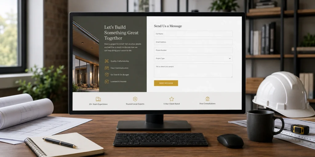
Building Trust within the Form Experience
A contact form is a moment of vulnerability for the homeowner. They are handing over their personal information and inviting a stranger into their home. To increase conversions, you must surround your form with “Trust-Reinforcement” signals. This includes a short privacy statement promising not to sell their data and a clear “Expectation of Response.”
Instead of a generic “Submit” button, use text that reinforces the value they are about to receive. Phrases like “Get My Free Estimate” or “Request My Emergency Dispatch” are much more effective. Additionally, placing a small badge next to the form that says “Rated 5-Stars in [City]” or “Licensed and Insured” can provide the final nudge of confidence a user needs to hit the button.

Mobile-First Form Optimization
Since the majority of your leads are using mobile devices, your form must be designed for “Fat-Finger” accuracy. This means ensuring that the input fields are large enough to tap easily and that the “Submit” button is prominent. Use “Input Masking” so that when a user clicks the phone number field, their phone automatically displays the numeric keypad instead of the full keyboard.
Friction-free mobile forms also avoid “Capcha” systems that require users to identify fire hydrants or crosswalks. These are notoriously difficult on mobile and often result in lost leads. In 2026, there are more sophisticated, “Invisible” spam-protection tools that keep your inbox clean without frustrating your legitimate customers.
The “After-Submit” Experience
The conversion process does not end when the user hits the button. What happens next is critical for lead retention. A high-converting form should immediately redirect the user to a “Thank You” page that provides clear next steps. Tell them exactly when they can expect a call: “One of our experts will call you within 60 minutes.”
This immediate feedback reduces “Lead Remorse” and prevents the homeowner from continuing their search and calling your competitors. You can also use this page to offer additional value, such as a link to a “What to Expect During Your Appointment” guide or a gallery of recent projects. By managing their expectations and providing instant professional feedback, you solidify the lead and begin the relationship on a high note.
Conclusion
Optimizing your contact forms is one of the most cost-effective ways to grow your home-service business. You do not need more traffic; you need to do a better job of capturing the traffic you already have. By embracing multi-step designs, removing unnecessary fields, and prioritizing the mobile experience, you can turn a stagnant contact page into a high-powered lead-capture engine. In 2026, the contractors who win are the ones who make it easiest for the customer to say “Yes.” When you remove the friction from your forms, you open the door to a consistent stream of high-quality, high-value service calls.


