Contractor website design mistakes can quietly push away serious leads before they ever call. Poor mobile functionality, weak calls to action, stock photos, confusing navigation, and shallow proof create friction that lowers trust and kills conversions.
Key takeaways:
- Mobile-first design is critical for contractor leads
- Clear CTAs should appear throughout every page
- Real project photos build more trust than stock images
- Simple navigation helps visitors find services faster
- Process pages attract more organized, high-intent clients
- Case studies provide deeper proof than basic testimonials
- Professional site performance reflects work quality
When contractors fix the design issues that create doubt and friction, their websites become stronger lead filters that attract better clients and convert more visitors into inquiries.
The difference between a thriving contractor and one who is struggling often comes down to the functionality of their website. In 2026, searchers are more discerning than ever. They are constantly bombarded with options, and they use visual and functional cues to judge a contractor’s professionalism within seconds. If your website feels outdated, disorganized, or slow, you are subconsciously telling the homeowner that your physical work will be exactly the same.
Design mistakes do more than just look bad; they actively kill conversions by creating psychological and technical friction. To turn your website into a lead-generating machine, you must view every design element through the lens of the customer’s journey. By identifying and correcting these common errors, you can significantly lower your cost per lead and maximize the ROI of your SEO efforts.
Prioritizing Aesthetics Over Mobile Functionality
The most frequent mistake is designing a website for a large desktop screen first. In the home-services sector, the vast majority of your emergency leads are coming from mobile devices. A website that looks beautiful on a 27-inch monitor but is impossible to use with a thumb on a smartphone is a failed design.
Mobile-first architecture means that your most important information, such as your phone number and your service area, should be accessible without scrolling. Buttons must be large enough to tap easily, and forms should be minimized to only the essential fields. If a user has to “pinch and zoom” to read your content or find your contact info, they will bounce. In 2026, the algorithm and the homeowner both prioritize speed and ease of use over complex, heavy graphics.
Buried or Passive Calls to Action
A website without a clear, aggressive call-to-action is just an expensive brochure. Many contractors make the mistake of hiding their contact information on a separate “Contact Us” page or placing their phone number in a small, non-clickable font at the bottom of the site.
Your call-to-action should be the most prominent visual element on every page. Use high-contrast colors for buttons and place them in the header, the footer, and throughout the body of the content. Furthermore, avoid passive language. Instead of “Learn More,” use “Get a Fast Quote” or “Call for Emergency Service.” In a high-stakes environment like home repair, you must tell the user exactly what to do next to solve their problem.
Over-Reliance on Stock Photography
Nothing kills digital trust faster than generic stock photos. In 2026, homeowners can spot a fake “technician” or a staged “kitchen remodel” instantly. When you use stock photography, you are signaling that you either do not have real work to show or that you are not proud of the work you have done.
Authenticity is a massive conversion driver. Your website should feature real photos of your team, your branded vehicles, and your actual job sites. Even a slightly less “polished” photo of a real project you completed in a local neighborhood is more effective than a perfect stock image. Real photos provide the visual proof that homeowners need to feel safe inviting you into their homes.
Complex and Confusing Navigation Menus
A confused mind always says “no.” If your navigation menu is a labyrinth of twenty different service categories and sub-menus, you are overwhelming your visitors. When people are in a hurry, they want to find the specific service they need within two clicks.
Navigation-menu optimization involves simplifying your site structure into clear, logical silos. Use broad categories like “Plumbing,” “HVAC,” and “Electrical,” with drop-down menus for specific sub-services. If you try to put everything on the top level of your menu, you create a “wall of text” that causes users to freeze. A clean, intuitive navigation bar allows the user to self-segment and find their solution quickly, which drastically improves conversion rates.
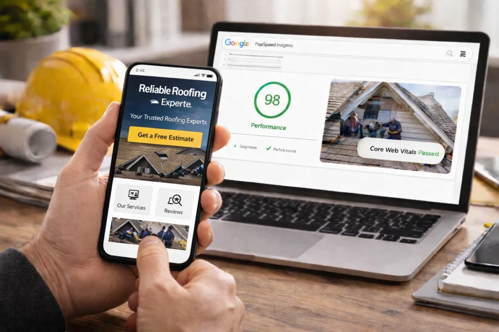
Slow Loading Speeds and Technical Lag
In 2026, speed is a core component of design. A website that takes more than three seconds to load is effectively invisible to a large portion of your audience. High-resolution images that are not properly compressed and bloated “legacy code” are the primary culprits of slow load times.
Technical performance is a reflection of your business’s efficiency. If your website is sluggish, a homeowner subconsciously assumes that your response time and project management will be sluggish as well. Optimizing your “Interaction to Next Paint” metrics ensures that your site feels snappy and responsive. This technical precision builds confidence and keeps the user engaged long enough to convert into a lead.
Lack of Immediate Trust Signals
When a user lands on your site, they are looking for reasons to trust you. If your licenses, certifications, and local reviews are buried at the bottom of an “About” page, you are missing an opportunity to build immediate rapport.
Trust signals should be integrated into the “above-the-fold” design. Displaying your 5-star Google rating, your BBB accreditation, and your industry-specific certifications (such as NATE for HVAC or GAF for roofing) near the top of the page provides instant validation. These badges act as a digital “seal of approval” that lowers the perceived risk for the homeowner and makes them more comfortable hitting the call button.
Conclusion
Correcting these design mistakes is the fastest way to increase your lead volume without spending an extra dollar on advertising. By focusing on mobile-first functionality, authentic visual proof, and friction-free navigation, you create a website that respects the user’s time and addresses their needs. In the 2026 marketplace, the contractors who win are the ones who make the digital path from “problem” to “solution” as short as possible. When your website functions as smoothly as your physical services, you create a seamless experience that turns anonymous searchers into loyal, high-value clients.